Shared design system

For MPG & MPP

App / Webiste

December 2024 - March 2025

Designing and maintaining multiple products comes with a constant challenge: consistency at scale.

This shared design system was created to power both MPG and MPP, two distinct products with different audiences and use cases, while relying on a single, unified foundation.By centralizing foundations, components, and assets, the system enables faster iteration, stronger visual coherence, and long-term maintainability across teams and platforms.

About the project

Our products

MPG and MPP are two football-related digital products with different audiences, features, and business objectives.
While each product has its own identity and use cases, both rely on shared interaction patterns, interface logic, and design principles across mobile and web platforms.

Their challenges

As both products evolved independently, maintaining visual consistency and interaction quality became increasingly complex.
Design decisions were duplicated, components diverged over time, and scaling new features required additional effort to stay aligned across products and platforms.

Constraints

The design system had to support two active products with ongoing feature development, without slowing down delivery.
It needed to be flexible enough to adapt to product-specific needs, while remaining strict enough to ensure consistency, maintainability, and long-term scalability across teams.

My role

I led the design system initiative, from defining foundations and tokens to building reusable components and documentation.
My role involved structuring the system to serve both products efficiently, collaborating closely with designers and developers, and ensuring the system could evolve alongside product needs.

Design system overview

One shared system, designed to support multiple products.

The design system is built around a shared core that serves both MPG and MPP. Rather than maintaining separate systems for each product, a single foundation was defined to centralize design decisions, reduce duplication, and ensure long-term consistency. The system is structured in clear layers, allowing shared rules and components to coexist with product-specific adaptations when needed.

Foundations

The shared rules that define the visual and structural consistency of the system.

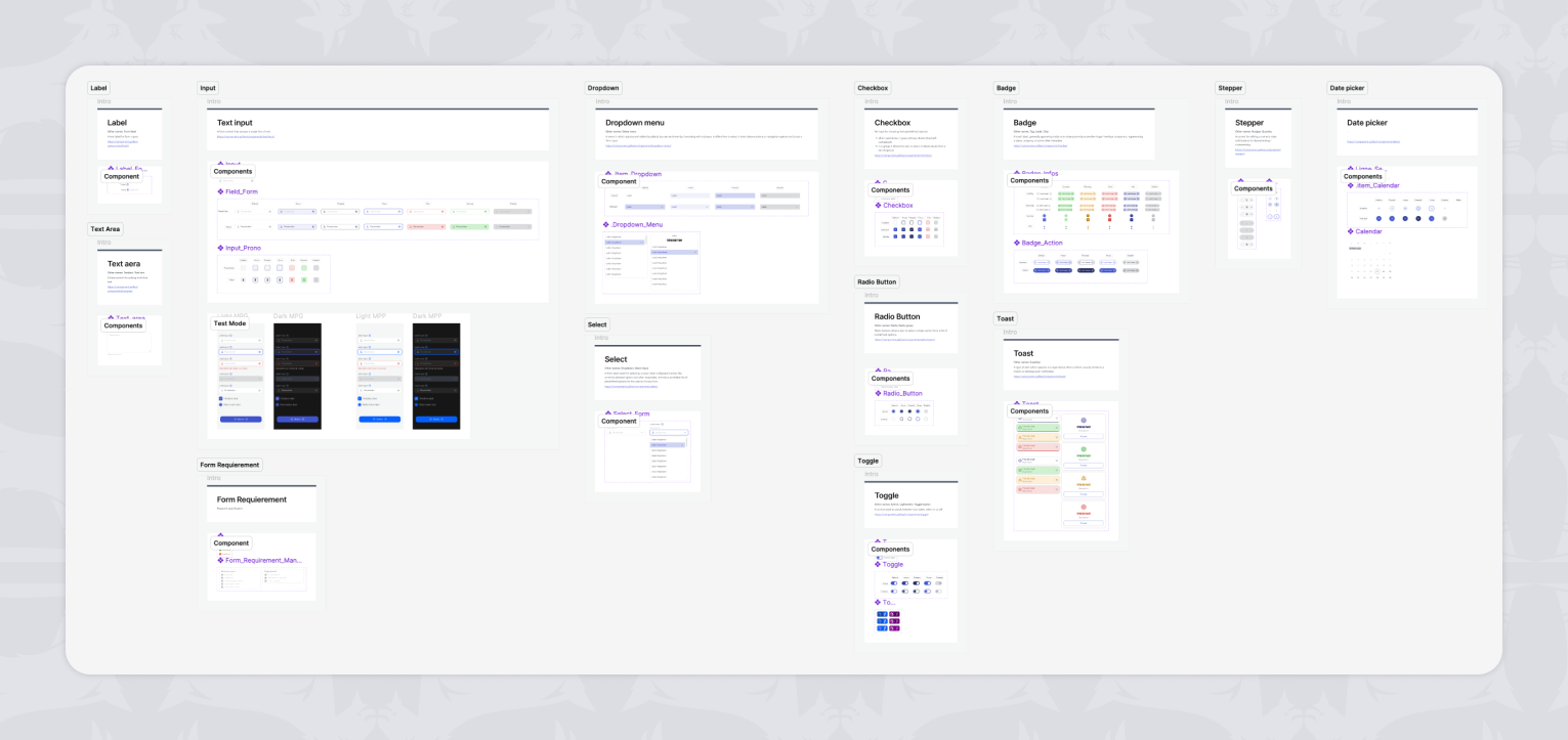
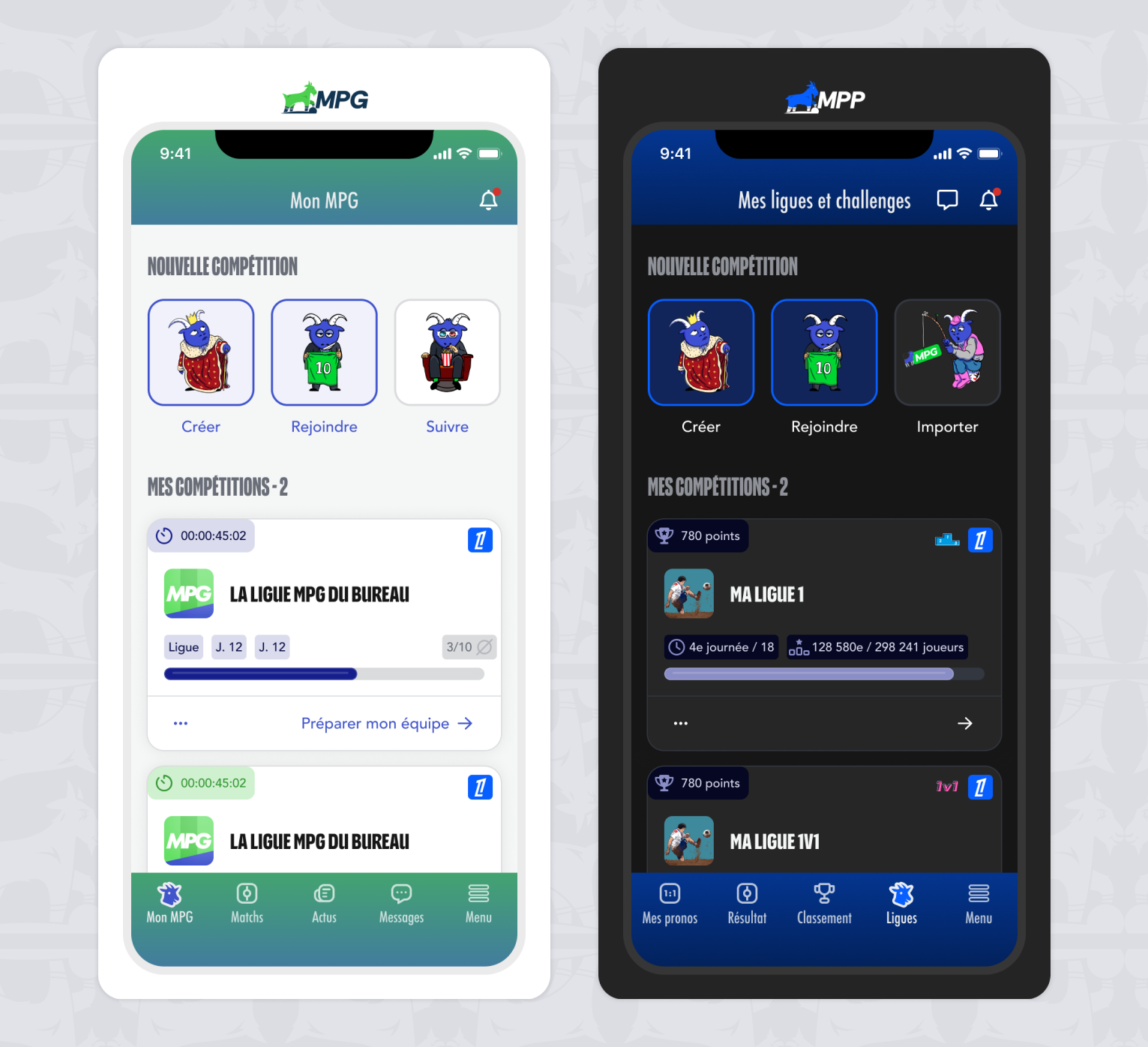
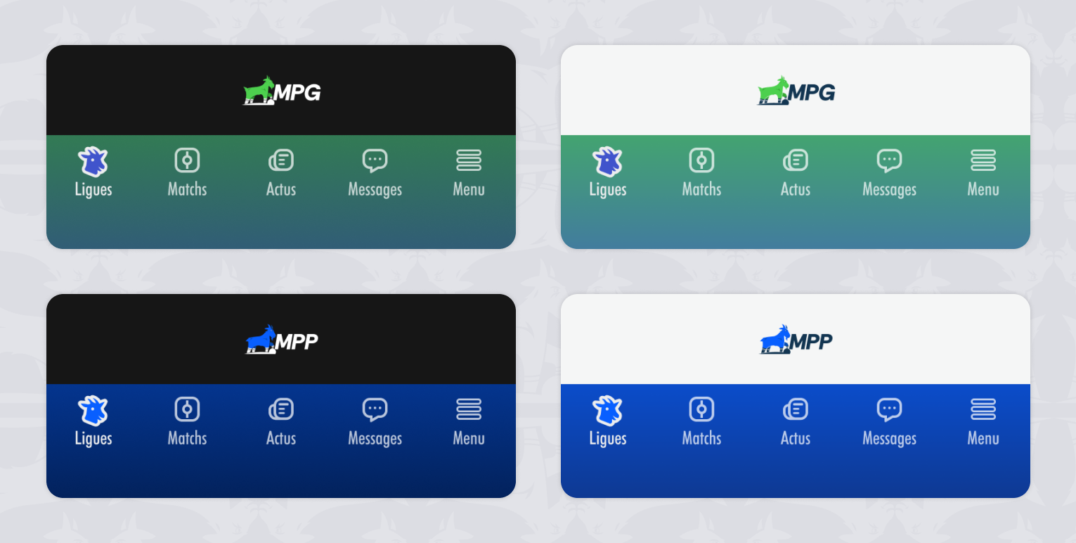
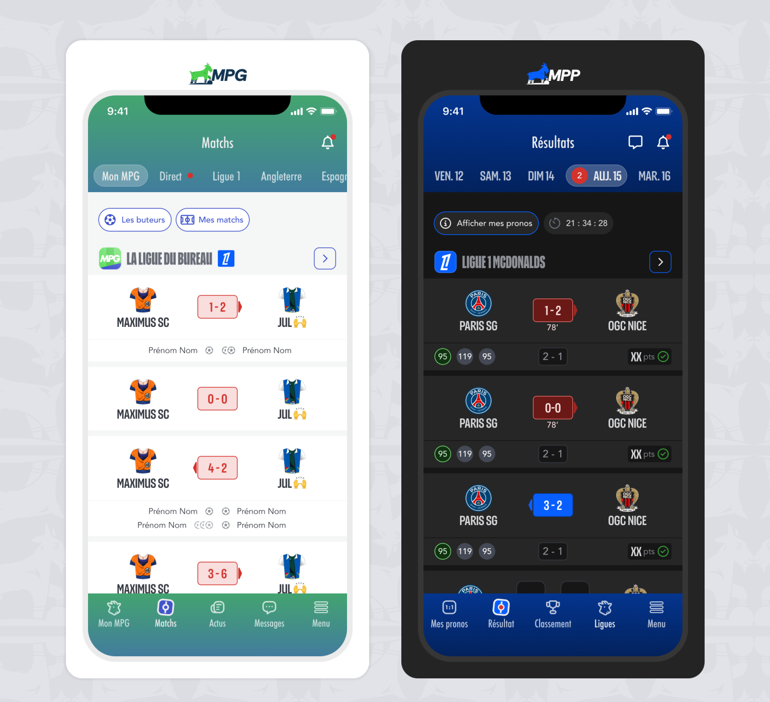
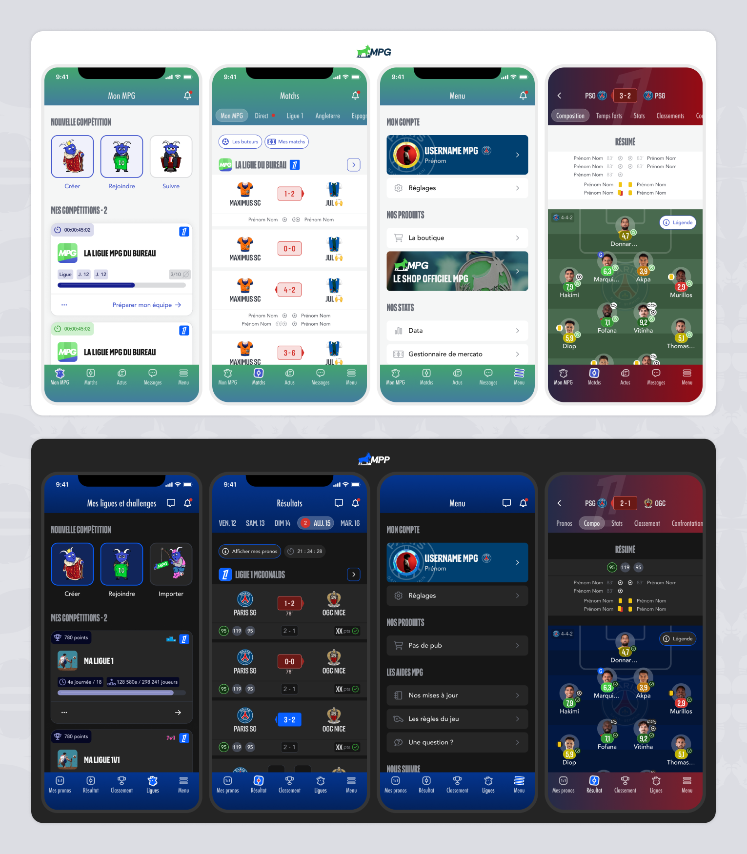
Foundations form the backbone of the design system. They define the core visual and structural rules shared across MPG and MPP, ensuring consistency across interfaces while reducing design and implementation overhead. By centralizing foundational decisions such as color, typography, spacing, and layout principles, the system provides a predictable and scalable base upon which all components are built.

Token architecture

A layered variable system designed for scalability and safe evolution across multiple products.

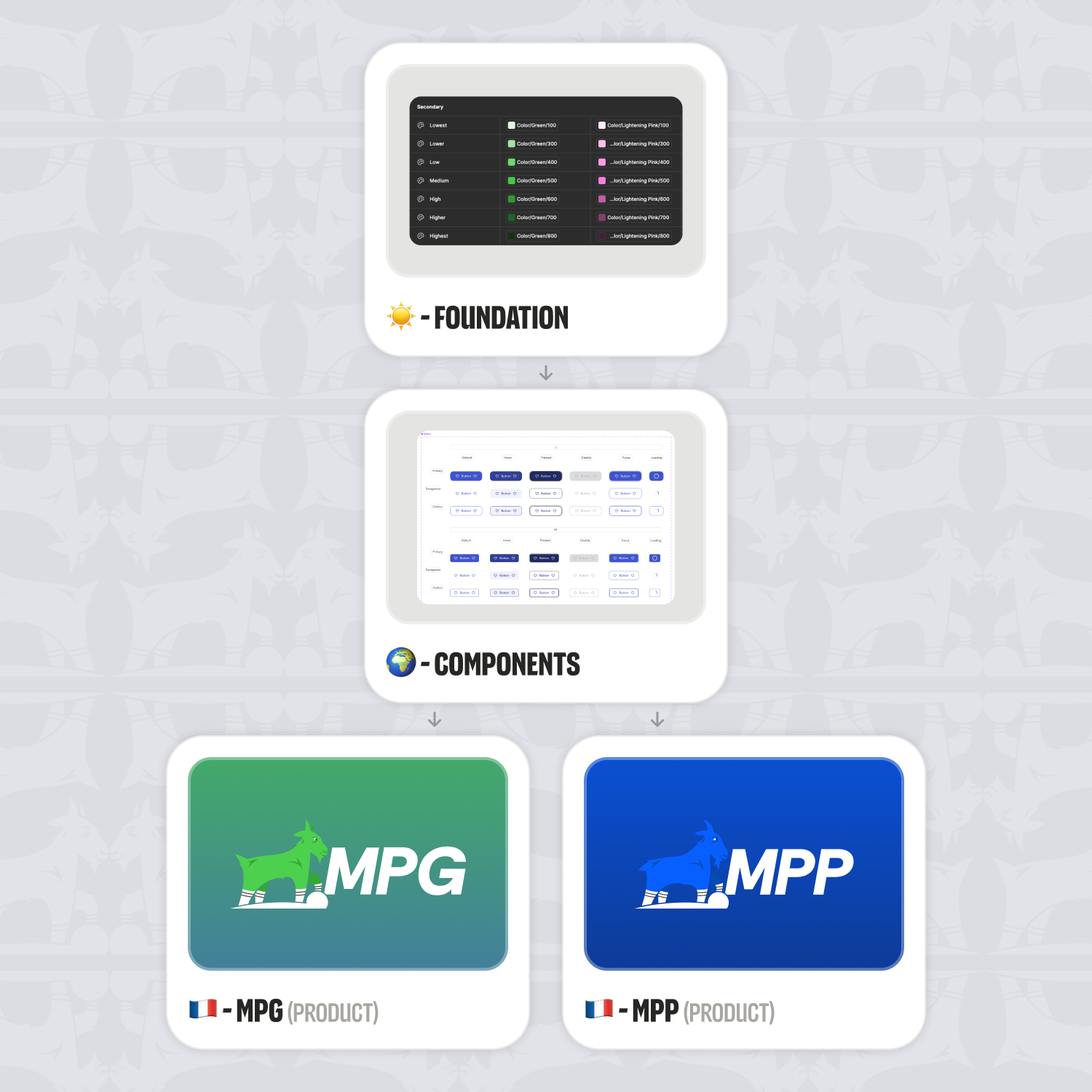
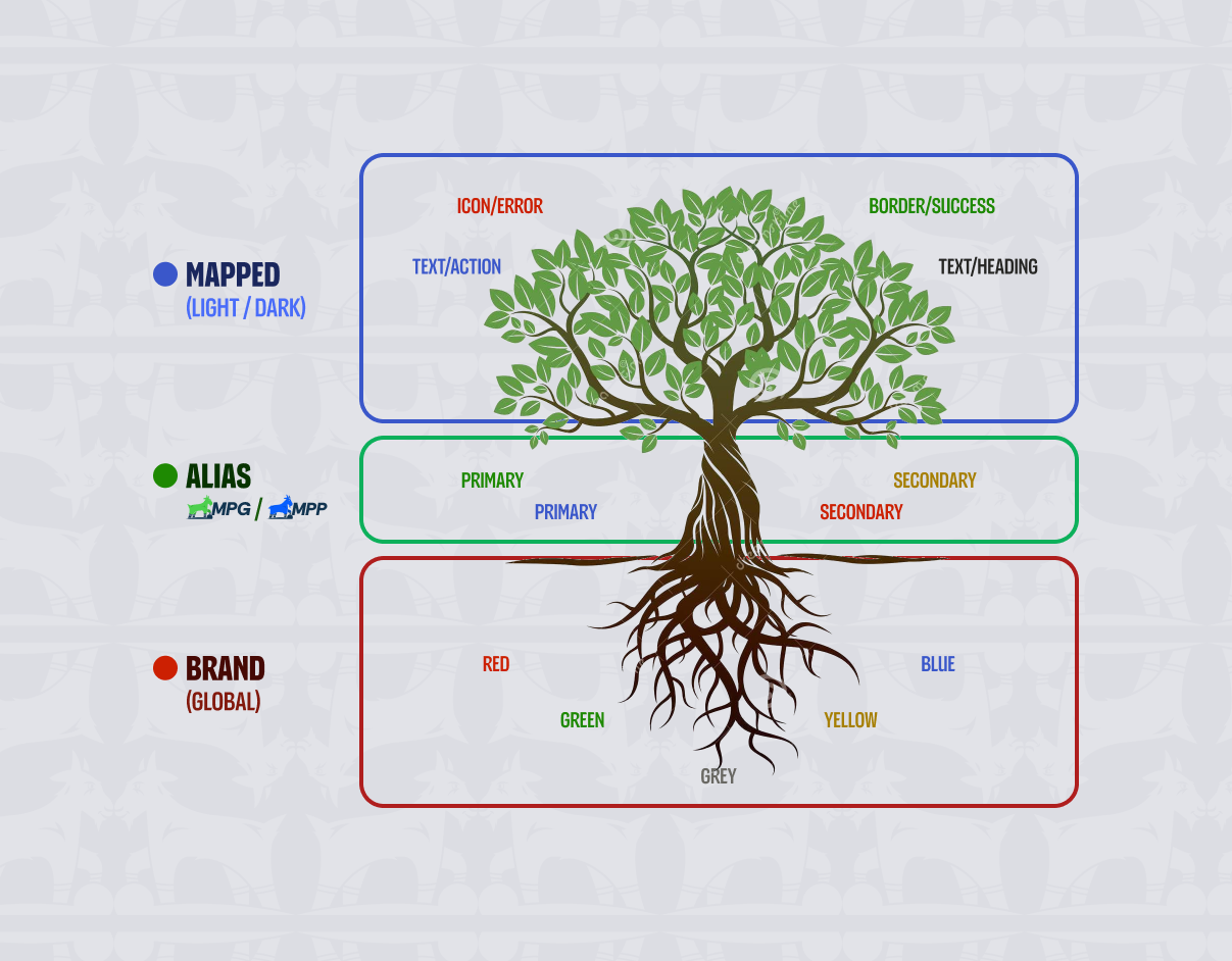
The design system is built on a four-level token architecture that clearly separates raw values, design intent, UI usage, and responsive behavior.

Brand
Global raw values (colors, typography, spacing) defined as primitives. These tokens act as a stable source of truth and are never used directly in product files.

Alias
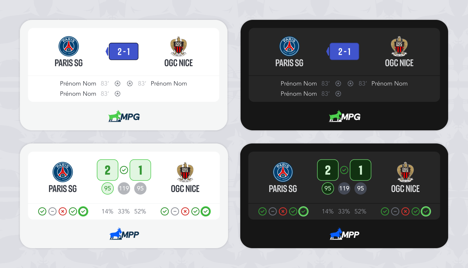
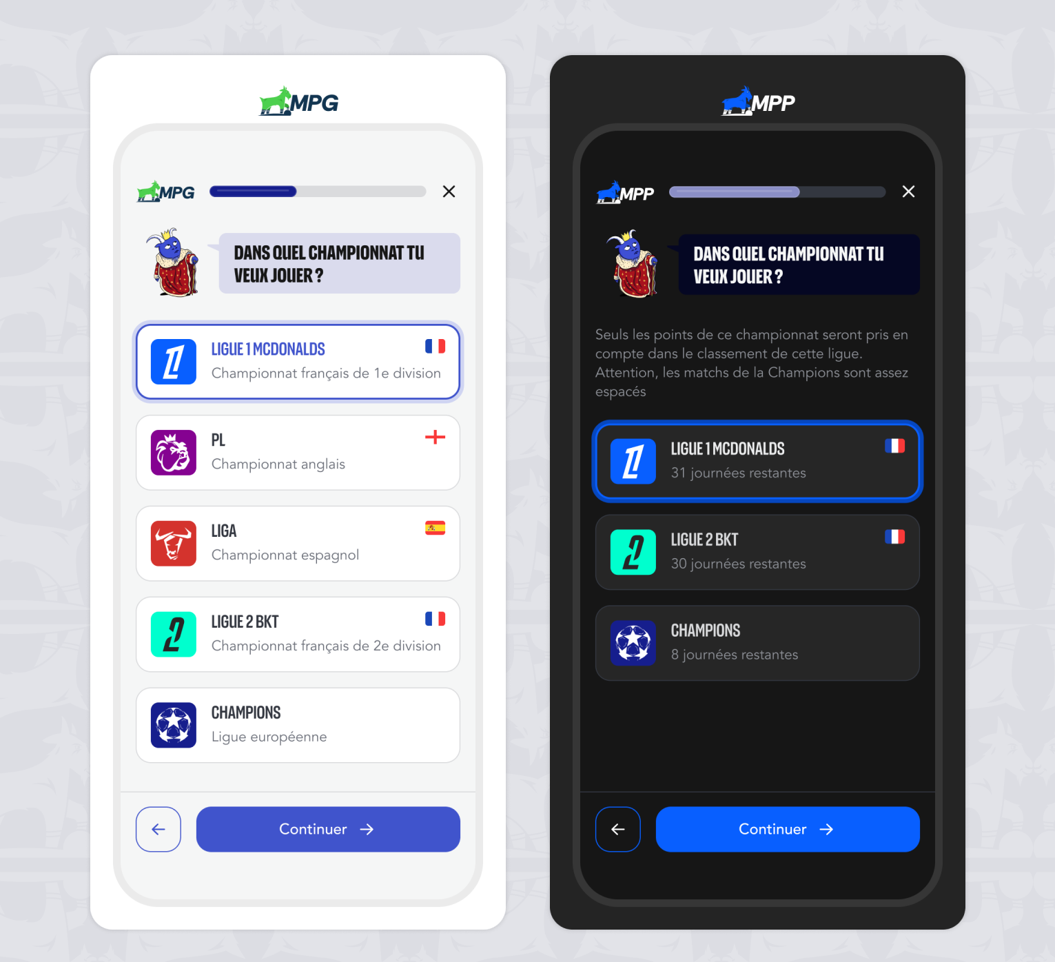
An intermediate semantic layer that expresses design intent and hierarchy (Primary, Neutral, Success, Error…). This layer also handles product differentiation, allowing MPG and MPP to share the same design logic while supporting product-specific adjustments when needed — without duplicating foundations or components.

Mapped
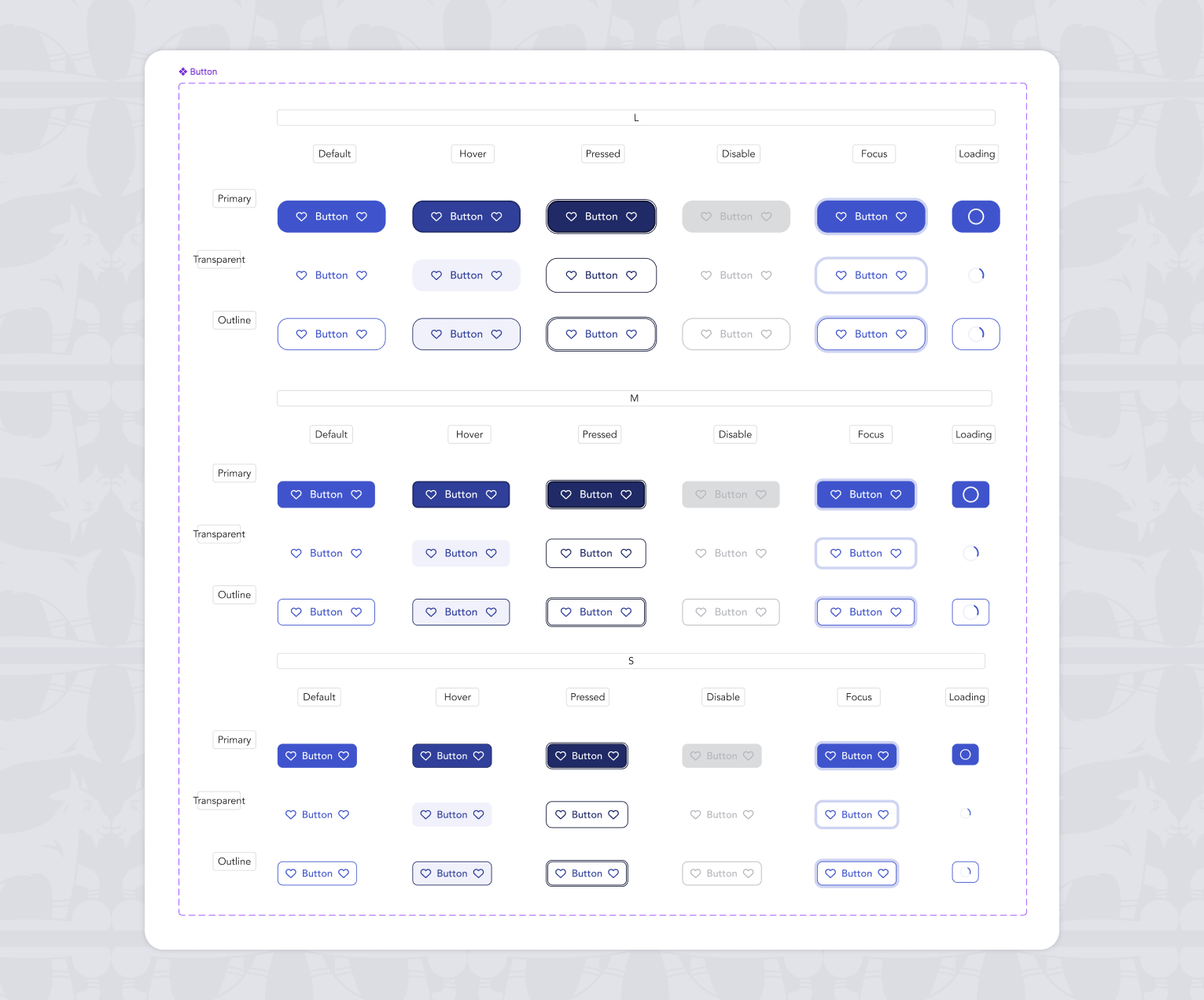
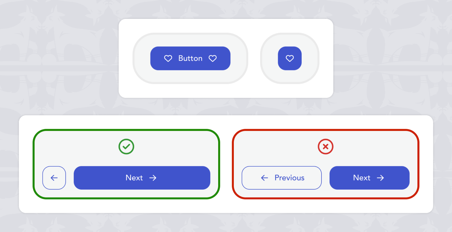
The UI-facing layer used exclusively in Figma product files. Tokens are mapped to concrete roles such as text, surface, icon, border, and states, with automatic resolution for light and dark themes.
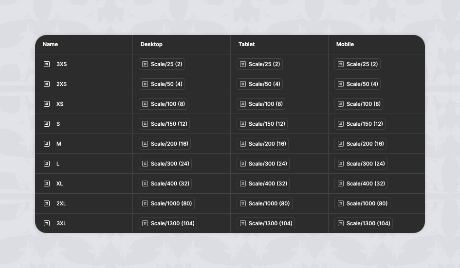
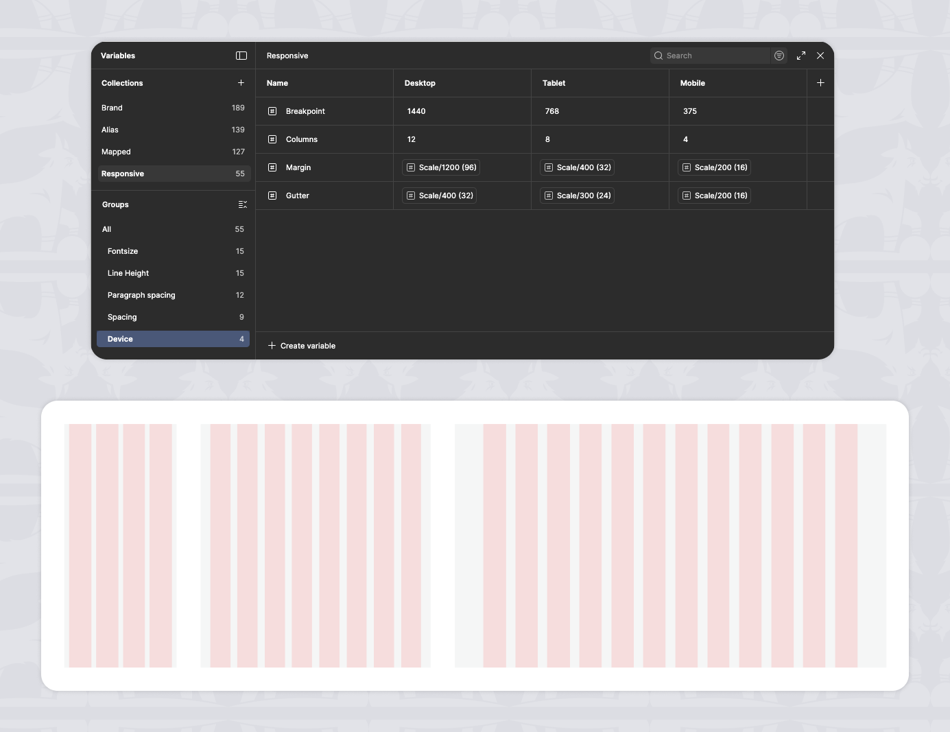
Responsive
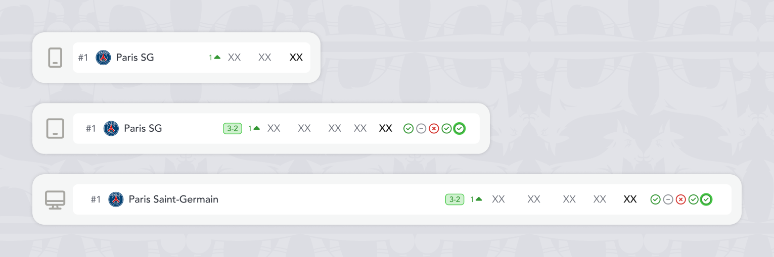
A dedicated layer that centralizes typography scales, spacing, grid, and breakpoints across Desktop, Tablet, and Mobile, ensuring consistent adaptation across devices. This architecture enables multiple products to coexist on a shared system while remaining flexible, maintainable, and safe to evolve over time.
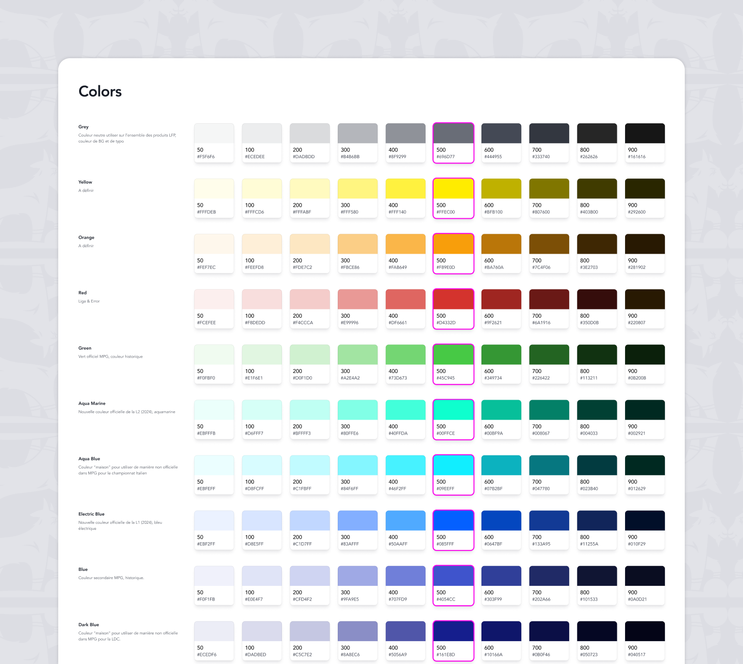
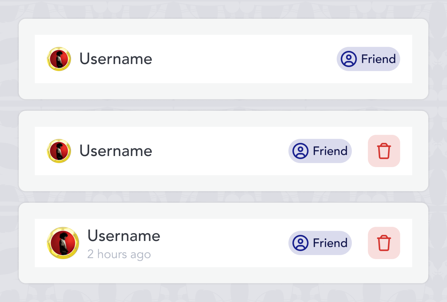
Color system

A token-based color system designed to ensure consistency, accessibility, and flexibility across products.

Spacing & layout

A consistent spacing system used to structure layouts and ensure visual rhythm across screens and products. A shared spacing scale was defined to ensure visual rhythm and consistent layout density across products.

Grid & structure

Layout principles designed to adapt seamlessly across devices while preserving structure and clarity. Layout grids were designed to support responsive behaviors while maintaining structural consistency across screens.

Components system

Intro

The component system builds on top of the shared foundations and provides a reusable set of UI components used across our two products, MPG and MPP. Components are designed to be consistent, flexible, and adaptable to each product’s needs without duplication.

Design principles

The component system follows a shared-by-default approach. Flexibility is achieved through configuration, variants, and tokens rather than product-specific components.

Shared usage across products

All components are shared between MPG and MPP. Even when a component is rarely used in one product, it remains part of the shared system to preserve consistency and avoid fragmentation.

Variants and states

Each component supports multiple variants and interaction states such as hover, pressed, disabled, and loading. This allows the same component to adapt to different contexts while remaining predictable.

Responsive and adaptability

Components are designed to adapt across Desktop, Tablet, and Mobile using shared responsive rules. Sizing, spacing, and behavior are driven by system tokens to ensure consistency across devices.

Scalability and maintenance

The component system is designed to evolve safely over time. New components are introduced only when existing patterns cannot cover the need, limiting duplication and keeping the system maintainable.

Patterns & Templates

Introduction

Patterns and templates define how components are assembled to build consistent screen layouts across products.
They operate at a higher level than components, structuring recurring user flows while remaining independent from product-specific content.

Shared patterns

Shared patterns represent recurring interaction and layout solutions used consistently across all products.
They standardize navigation, feedback, and system states to ensure a predictable and coherent user experience.

Screen templates

Screen templates are predefined screen structures composed of patterns and components.
They serve as a foundation for building screens quickly while maintaining layout consistency and interaction rules.

Cross-product adaptation

Templates are designed to be product-agnostic and adaptable to different functional contexts.
Each product applies the same structural foundations while introducing controlled variations based on its specific needs.

Usage & guidelines

Clear usage rules define when to reuse existing templates and when to create new variations.These guidelines help maintain consistency, avoid unnecessary fragmentation, and keep the system scalable over time.

Impact

Patterns and templates significantly reduce design and development effort while improving UX consistency.
They enable faster iteration, easier collaboration across teams, and long-term scalability across multiple products.

what I learned
&
what I'd do next

This project helped me develop a much deeper understanding of variables and led to a more advanced use of Figma in my daily design work.

Looking ahead, I would involve developers earlier in the process to better align on rules, naming conventions, and component structures, strengthening collaboration between design and engineering.